
Our brand
One line, three ideas.
How Disha Hospital looks and sounds, and why. A hospital should feel calm before it feels urgent.
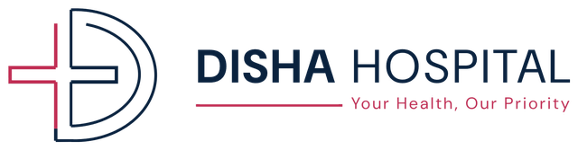
The mark
The D. Two concentric arcs, the hospital's initial, and a door opening. Drawn as a line, never filled.
The cross. Care, made from the same line. Its right edge is the D's stem: one drawing, not two marks stacked.
The turn to navy. The cross runs crimson down its length and turns navy at the foot, urgency resolving into steadiness.
Colour
Two colours, and what holds them up
Two thirds of every surface is white, a quarter is navy, and crimson gets the rest, the cross, one rule, one number, the word EMERGENCY.
- Disha Navy#0A223EStructure. Type, dark surfaces, the D.
- Care Crimson#BE244CCare. The cross, emergency, the one accent.
- Clinic White#F7F9FBThe ground. Walls, paper, screens.
- Steel#48586BBody text on white.
Typography
One typeface: DM Sans
The logo is set in it, so everything else is too. A form, a sign and a discharge note all read as one hospital, and nobody has to guess.
Bold, headlines and the word EMERGENCYMedium, labels, wayfinding, buttonsRegular, everything read at length
Graphic language
The cross field and the pulse line
The mark's cross, repeated on an offset grid, is the hospital's texture, always quiet, never behind body text. The pulse line is one beat, never a row of them, so it reads as calm interrupted, not as alarm.
Voice
How a hospital should sound
Plain words, always
'Heart attack', not 'myocardial infarction', unless the reader is a clinician.
Certain, never absolute
'Most patients go home the same day', not 'you will go home the same day'.
Calm carries further than urgent
Nothing shouts except the word EMERGENCY and the number beside it.
Say the cost
Where a price can be given, give it. Where it cannot, say what it depends on.
The lines Disha owns
Your Health, Our Priority.
The promise. It sits under the logo.
Care today, for brighter tomorrows.
Campaigns and public-facing print.
Advanced care, closer to you.
For Chitradurga and the districts around it.
Healthy people, happier communities.
Camps, screenings and school programmes.
Credits
Disha Hospital's brand identity, guidelines and website were designed and built by BRANDSWOT Consultancy, a brand strategy and digital consultancy that has worked with the hospital since its first website in 2023.